The most common Chart customisation requests I’m hearing from customers relate to showing 2 data series on 1 chart.
Standard CRM configuration options in the UI only allow you to plot one data series on a graph, i.e. one field value. If you want to show say Actual vs. Budget visualisations you need to do a bit of customisation:
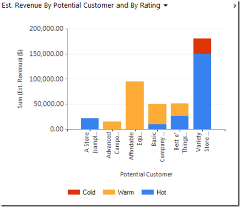
And the same is true if you want to show stacked column charts like the one below:
Good news is this stuff is really easy to learn and really quick to action.
Here’s the steps:
1. Start by creating one or more Charts that are similar to what you want.
To get the Chart shown in screenshot 1 I first created a Column Chart like the below that gave me the sum of Actual Revenue per Customer…
And a Line Chart like the below to give me the sum of Est. Revenue per Customer…
2. Export each of these Charts to XML and save to your desktop.
3. Our approach here will be to modify the definition of the exported “Actual Revenue Column Chart” to come with the new definition of the new Chart. Open that XML definition in Visual Studio.
The code snippet below contains the final result containing each of the following changes:
<visualization>
  <visualizationid>{182867B5-3954-E011-8E49-1CC1DE6E4B49}</visualizationid>
  <name>Actual vs. Est. Revenue by Potential Customer</name>
  <primaryentitytypecode>opportunity</primaryentitytypecode>
  <datadescription>
    <datadefinition>
      <fetchcollection>
        <fetch mapping="logical" aggregate="true">
          <entity name="opportunity">
            <attribute alias="aggregate_column" name="actualvalue" aggregate="sum" />
            <attribute alias="aggregate_column2" name="estimatedvalue" aggregate="sum" />
            <attribute groupby="true" alias="groupby_column" name="customerid" />
          </entity>
        </fetch>
      </fetchcollection>
      <categorycollection>
        <category>
          <measurecollection>
            <measure alias="aggregate_column" />
          </measurecollection>
          <measurecollection>
            <measure alias="aggregate_column2" />
          </measurecollection>
        </category>
      </categorycollection>
    </datadefinition>
  </datadescription>
  <presentationdescription>
    <Chart>
      <Series>
        <Series IsValueShownAsLabel="False" Color="55, 118, 193" BackGradientStyle="TopBottom" BackSecondaryColor="41, 88, 145" Font="{0}, 9.5px" LabelForeColor="59, 59, 59" CustomProperties="PointWidth=0.75, MaxPixelPointWidth=40"></Series>
        <Series BorderWidth="3" ChartType="Line" Color="255, 0, 0" MarkerStyle="Square" MarkerSize="9" MarkerColor="37, 128, 153" MarkerBorderColor="37, 128, 153"></Series>
      </Series>
      <ChartAreas>
        <ChartArea BorderColor="White" BorderDashStyle="Solid">
          <AxisY LabelAutoFitMinFontSize="8" TitleForeColor="59, 59, 59" TitleFont="{0}, 10.5px" LineColor="165, 172, 181" IntervalAutoMode="VariableCount">
            <MajorGrid LineColor="239, 242, 246" />
            <MajorTickMark LineColor="165, 172, 181" />
            <LabelStyle Font="{0}, 10.5px" ForeColor="59, 59, 59" />
          </AxisY>
          <AxisX LabelAutoFitMinFontSize="8" TitleForeColor="59, 59, 59" TitleFont="{0}, 10.5px" LineColor="165, 172, 181" IntervalAutoMode="VariableCount">
            <MajorGrid LineColor="Transparent" />
            <LabelStyle Font="{0}, 10.5px" ForeColor="59, 59, 59" />
          </AxisX>
        </ChartArea>
      </ChartAreas>
      <Titles>
        <Title Alignment="TopLeft" DockingOffset="-3" Font="{0}, 13px" ForeColor="59, 59, 59"></Title>
      </Titles>
      <Legends>
        <Legend Alignment="Center"></Legend>
      </Legends>
    </Chart>
  </presentationdescription>
  <isdefault>false</isdefault>
</visualization>
The 1st change I made was to to rename the Chart. This is an optional step and you can change this later during or after import but I like to do this:
The 2nd change is to the Fetch XML query that collects the data for the Chart. The Actual Value Bar Chart only fetches the actualvalue attribute so we need to add here the estimatedvalue attribute. Now, if we go and open the “Estimated Value Line Chart” that we exported we can copy this line from there. But we need to make sure each Attribute specified here has a unique alias so if you do this just adjust the alias to something else:
The 3rd change is to add a second measurecollection to the definition. This tells CRM that we want another data series presented on the Chart and instructs CRM which attribute from the Fetch XML query provides the data value:
The 4th change is to the Series definition. Here we copy and paste across the Series definition from the “Estimated Value Line Chart”. I also make 2 additional cosmetic changes which are optional but which improve the readability of the visualisation once rendered:
- Change the colour of the “Estimated Value Line Chart” series to “255, 0, 0” to switch to a red line
- Change the IsValueShownAsLabel property of the “Actual Revenue Column Chart” series to “False” to hide the data point values that appear above each bar.
That’s it. Final steps are to Save the updated XML file and then re-import it back into CRM.
Note: As you import it CRM will recognise that the XML definition originated from an existing Chart and will give you the option to overwrite the existing definition or add a new Chart.
Here’s the end result:
There’s more you can do to improve the appearance of the end result but these steps should give you nice simple replicable steps to get to this point quickly.
Now, to create the Stacked Column Chart the steps are much easier. To demonstrate this let’s grab the exported “Actual Revenue Column Chart” XML that we have not modified. The change is a simple one, all we need to do is:
- Rename the Chart (if you want to)
- Add an additional attribute grouping (make sure it has a unique alias)
- Change the ChartType to “StackedColumn” (note: data series are presented as Bar charts by default if no ChartType is specified in the series. If your starting point is a Bar Chart you will need to add ChartType to the Series definition, otherwise you can just edit it)
That’s it. Save and import and you will get:
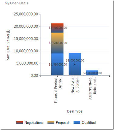
Update: I has to create a stacked chart today so came back to this blog. This time around my stacked chart turned out a little ugly, with this weird gradient fill:
Now I’m not sure whether I experienced this back when I wrote the above post and forgot to document how to fix it or whether things have changed. Anyway here’s how to ditch the gradient fill, simple delete the following from your chart XML:
I also had a new requirement. I was now dealing in high values and need to applying some formatting to my labels. I got the answer from this post. Here’s what I added to have my series labels show in millions:
I think the way to read that format string (from left to right) is: “I want…
– A “$” sign at the front
– The numerals to the left of the million separator to show
– The numerals to the right of the million separator not to show
– The numerals to the right of the thousand separator not to show
– An “m” at the end”
Here’s the end result:


It’s amazing…..
Really very helpful post…
Thank you.
Pingback: Charts in CRM 2011 « Nishant Rana's Weblog
Thanks Gareth – great post.
Would it be possible to have 2 data sets with data from 2 different entities in one graph?
Hey,
Really great post. Haven’t seen anything as detailed as this post.
One question, would you know how to turn absolute values in percentage values? For instance, when you stack two values on top of each other, how could I express that in percentages?
Thanks,
Manuel
Pingback: Dynamics CRM: Adding a radar chart | Pedro Innecco
Good Post !
Muito bom!!! Realmente bastante criativo!
Hey, great blog!..
Do you know how you could make labels on charts clickable?
How can I remove or disable a system chart?
Great Post. Thank you..Is it possible to add a Sum of the individual totals at the top of each stacked column? I would like to see both the individual number and the Sum of each column at the top.